STUDIO
SEBASTIAN LEINEHED
Försäkringskassan
The Swedish Social Insurance Agency
Project
Project
Försäkringskassan
Försäkringskassan
Year
Year
2014 – 2017
2014 – 2018
Deliverables
Keywords
Visual Identity
Branding
Design System
Visual Identity
Branding
Design System
Web / UI Design
Responsive Website
Service Design
Visual Identity
Branding
Design System
Web / UI Design
Försäkringskassan is one of Swedens largest authorities, responsible for the payout of the Swedish social benefits, such as Parental Pay, Sick Pay and Disability Grants.
I joined Försäkringskassan in 2014 to work on the monumental digitalisation of the social benefits, as well as updating the visual identity of the authority itself.
Our mission was not only to make the social benefits digitally available, but to also make them accessible, understandable and easy to apply for.
Tearing Down the Wall of Text
Commonly percieved as severely bureaucratic and overwhelmingly difficult to understand, information on the social insurance would be many's very definition of "hitting a Wall of Text".
Developing the new Försäkringskassan website, this was one of the primary design challenges.
Our mission was not only to make the social benefits digitally available, but to also make them accessible, understandable and easy to apply for.
So how do we distill the "Wall of Text" into a digestible and understandable format?
To replace the rigorous paper process then in place with digital services would have significantly positive effects on Försäkringskassans operations:
Reduced administrative costs
Positive environmental impact (fewer letters printed and sent)
Lessen administrative load for case workers
Eliminated need for many physical offices
["Money saved" data here]
Designing for Everyone
By law, Swedish government websites are required to be accessible to everyone. People of all ages needed to be able to use the site, including those with cognitive and physical disabilities.
This presented another big challenge; How does one design for everyone?

Achieving Sufficient Contrast
Being a public authority, there are accessibility requirements for all digital products written into Swedish law to make sure that everyone is able to access and use Försäkringskassans digital services. For a designer, this places a special type of limitations or constraints on your designs in regards to color combinations and content presentation.
As a Designer, being visually oriented comes with the territory. But what looks best might not always be what fits your design. And with many go-to color combinations off limits, is it still possible to make a visually appealing site?
Solution: A mobile-first, inclusive website, designed for guidance
The overall strategic principles for the website were Mobile First and Drive Toward Self-service.
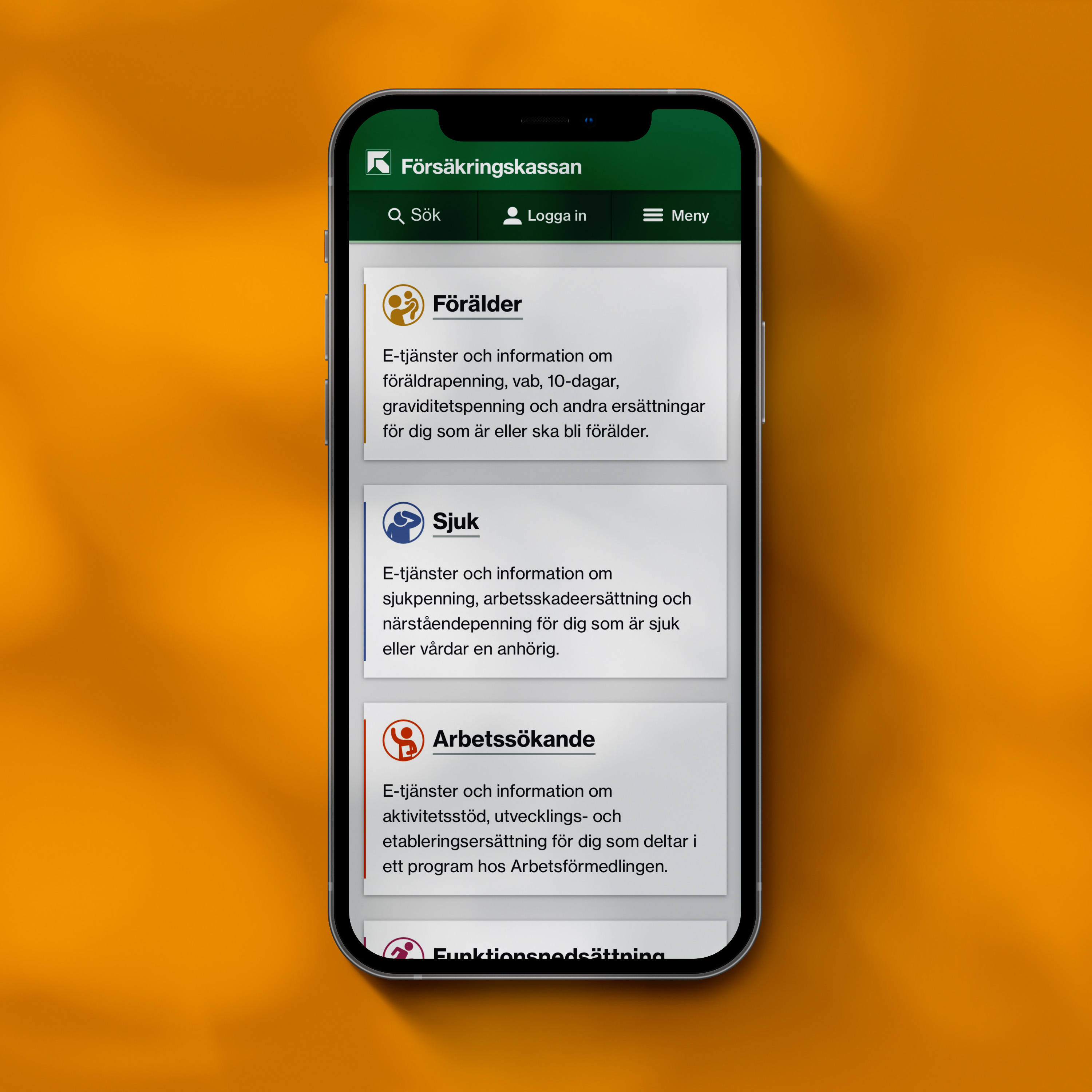
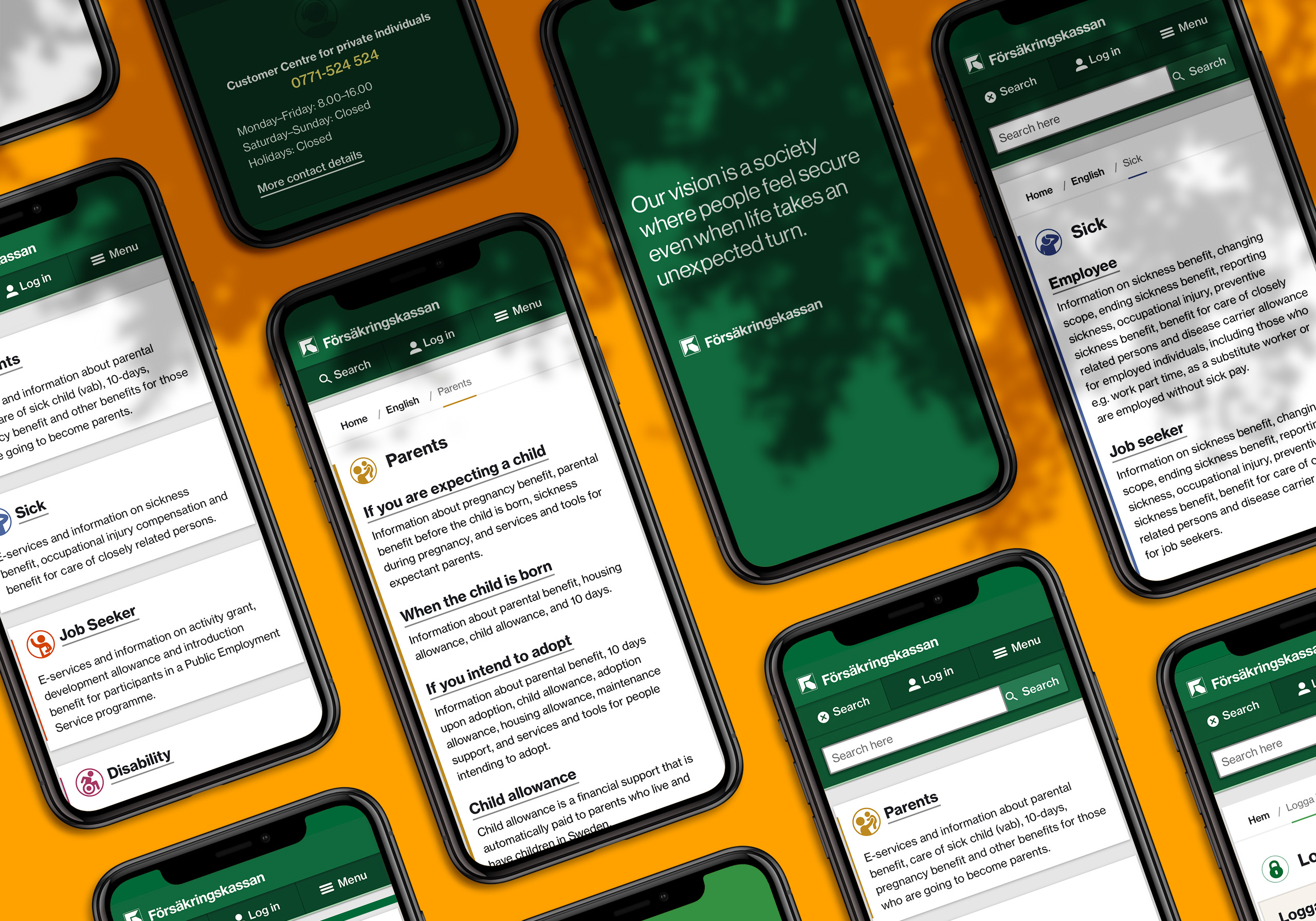
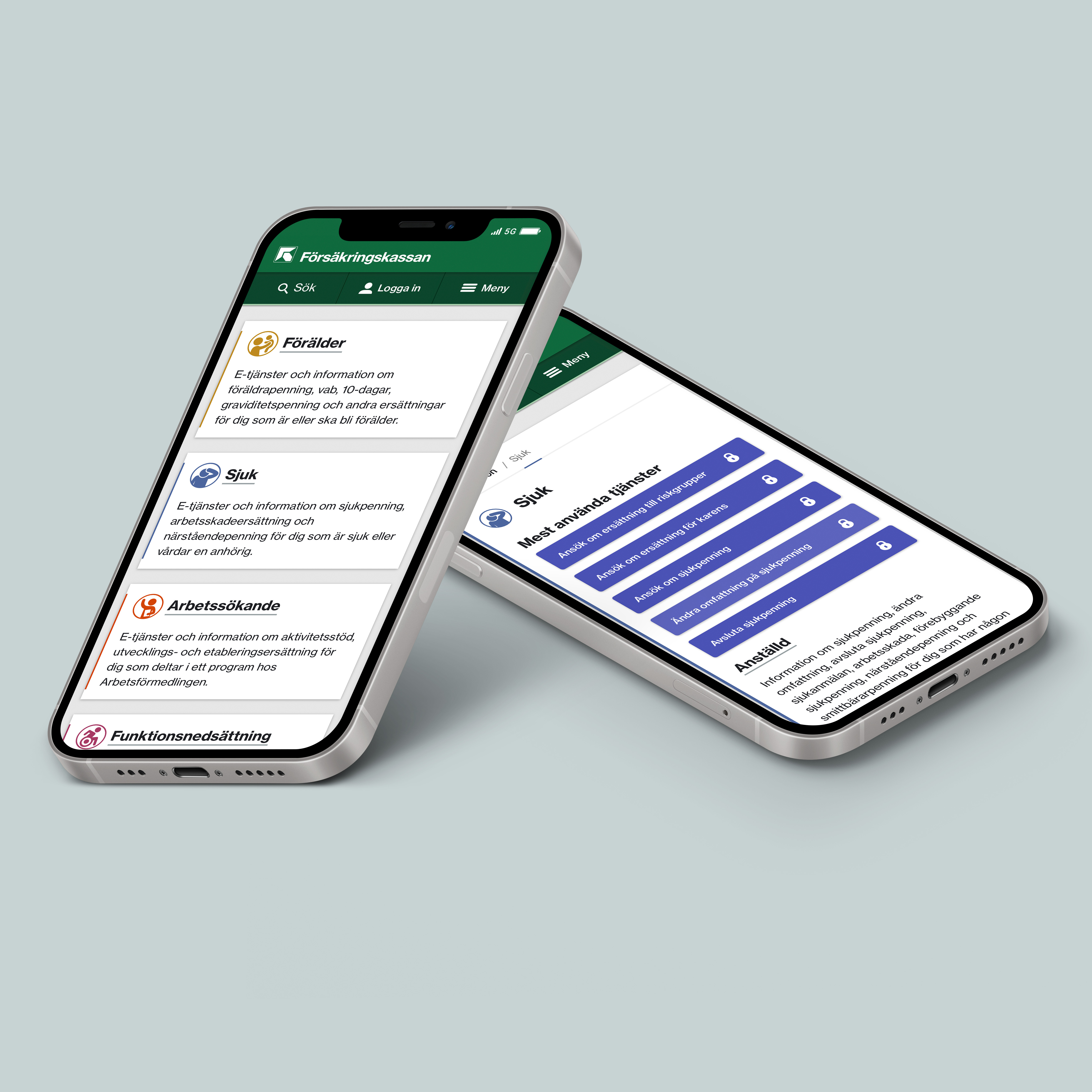
To enable users to complete their task in as few clicks as possible and simultaneously reduce cognitive load, top-level information is now limited to a few rows of text, followed by a CTA (Call to Action).
This allows the users to quickly navigate the information hierarchy without having to wade through irrelevant information.
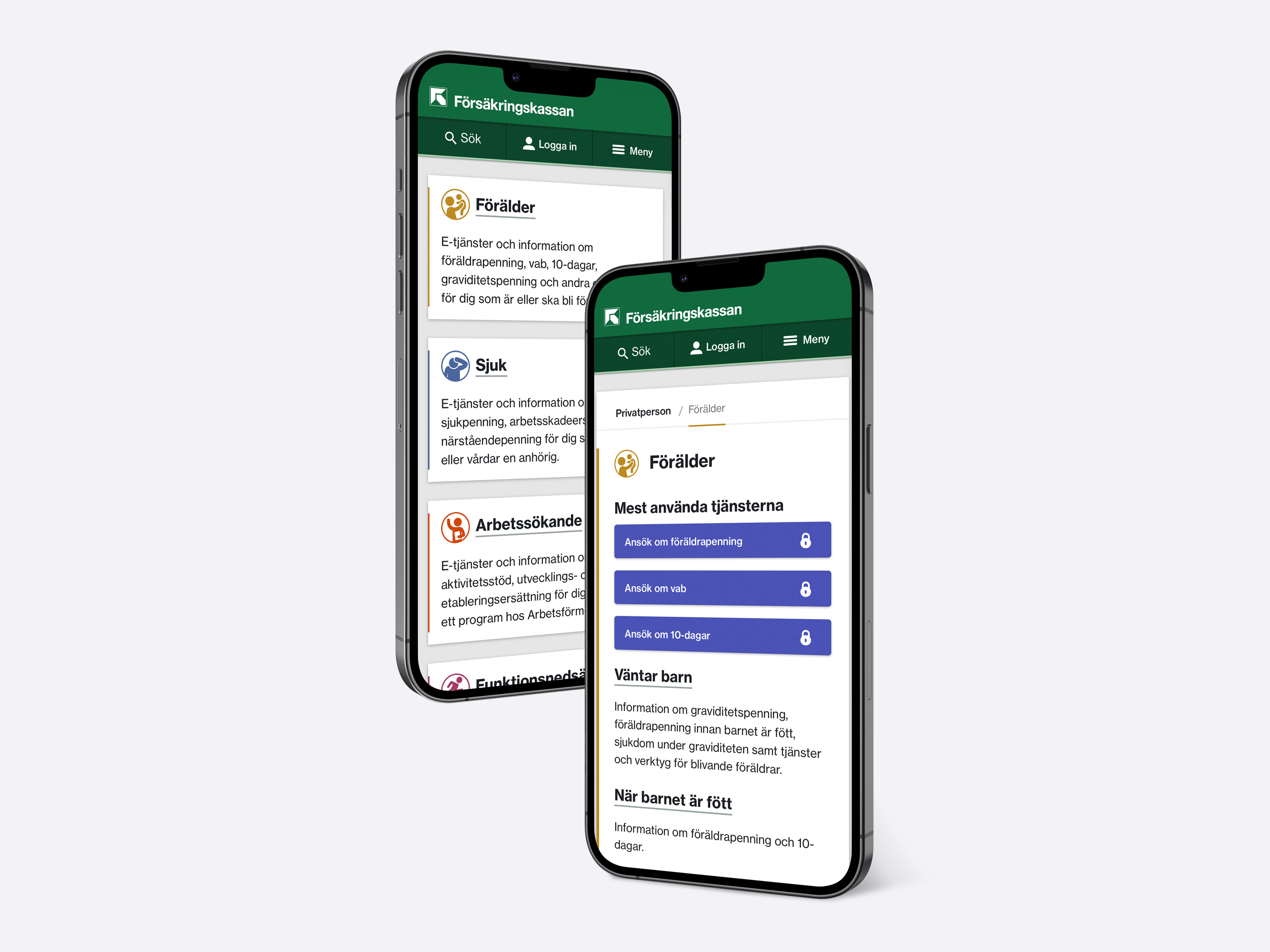
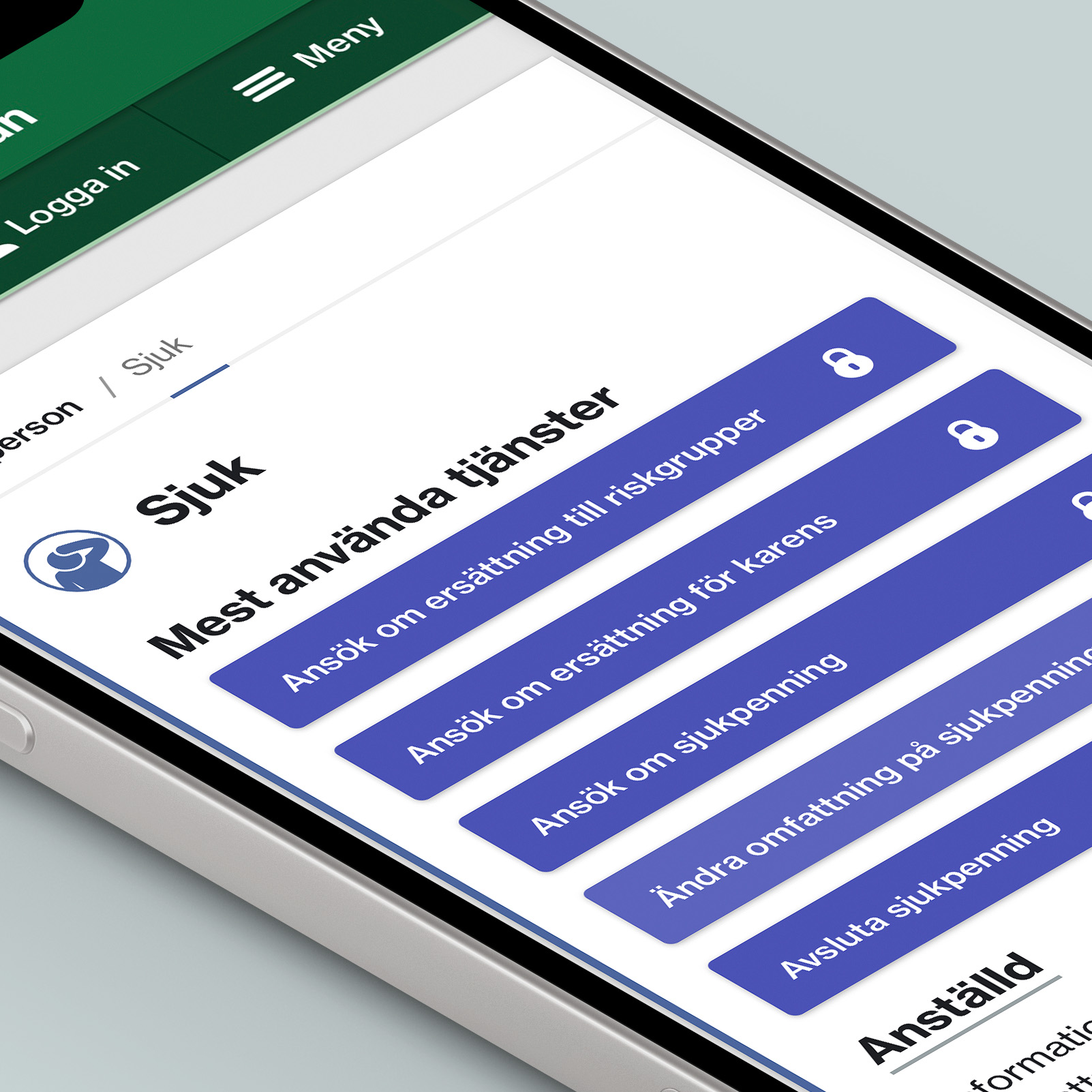
All benefits (”livssituationer”) are color coded for easily distinguishable information.
Every CTA (Call to Action) is visually prominent with the intention of guiding users toward the most commonly used self-services.
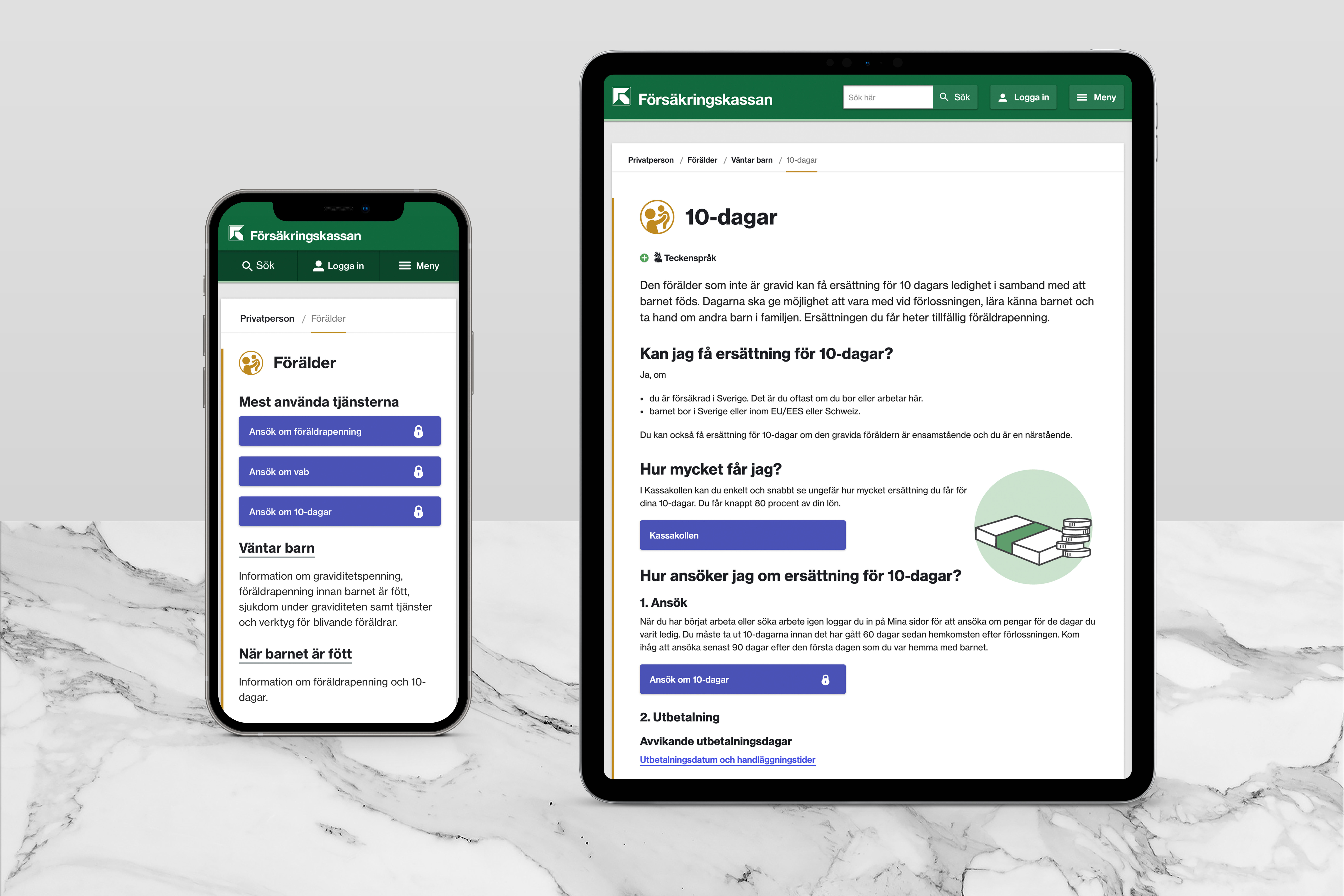
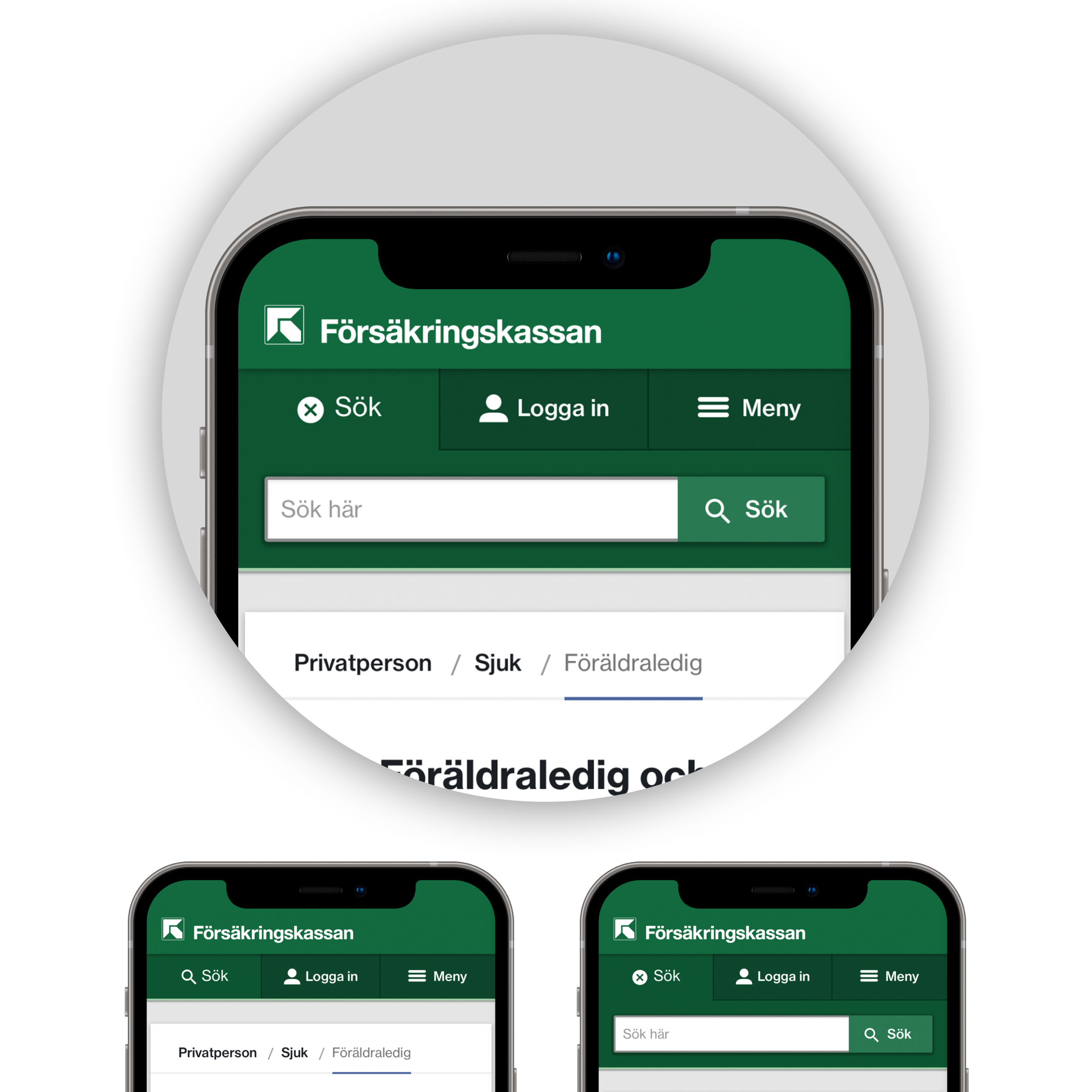
The site is built upon on a responsive card design, loosely based on the then newly released Material Design Guidelines used by Google in all their products. A concious choice based on factors like user familiarity and aesthetic longevity.
The site also features consistent AA contrast throughout (those familiar with WCAG requirements know this is a feat in itself) as well as other accessibility features such as screen reader functionality.
Atomic Design System
We created the Design System using the principles of Atomic Design, structuring the interface components into groups of ”atoms”, ”molecules” and ”organisms”.
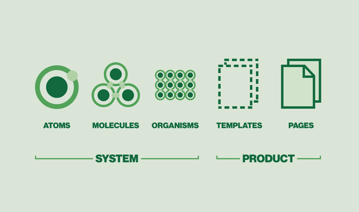

Starting with the smallest possible components like buttons, dropdowns, checkboxes, radio buttons and so on, we slowly began collecting enough atoms to start making molecules.

Molecules like for instance a login form or an information card.

Lastly, Organisms were iterated, which manifested themselves as page templates.
High Fidelity Interface Details
A lot of labour went into making the FK Design System components look and feel. well crafted. From interface animations and hover states down to the last drop shadow.

Launched in 2016, forsakringskassan.se was acknowledged with the prestigeous
Internetworld Website of the Year Award.
It was also awarded with first place in the category of Best Online Authority, an honor it has since then recieved in 2016, 2017, 2019 and 2020.
Instrumental to the success of Försäkringskassans digital presence, The FK Design System incorporates the raison d'être of a well built design system. (meaning; Make a commitment to putting effort into a solid foundation, then you'll be able reap the rewards long after.)
Entering 2022, Försäkringskassans communications and online presence still relies on the design principles etablished in 2015-2016, proudly displaying the intended longevity of the design system.
